Rationale.
Jacob Knight.
For this assessment I chose to recreate the Matrix scene, and transformed the genre from sci-fi adventure to family/comedy. One decision that I wanted to see through from the beginning of the animation process was that I wanted to make it as obvious as possible that I was referencing the Matrix scene. To do this I copied the same camera movements as the actual Matrix scene, as well as most of the characters movements (I had to add in some extra movements, such as the legs walking, because of the addition of the limbo stick). As you can see in the images above, during the concept development I storyboarded my character poses to match those of Neo. I feel that without using the same camera movements than the reference to the original would have been lost, and it would have just been a scene with an old lady doing the limbo. Also I feel that by drawing a close comparison between the two than my scene becomes more comical due to the serious and intense vibe that you get from the Matrix scene.
going to have my character wearing a typical old lady style
dress. The design to the right was what I was going to use for a
long time. However it was not until the story boarding stages
when I realized that this choice of clothing could be really
inappropriate. With the character doing poses such as this...
I hated this design and I thought it looked terrible. It was because of this that I desperately searched for
a good substitute, and ended up discovering the ocean shader. I was far happier with this material, as
it not only added more life to the scene but it also came with options that allowed me to customize the
ocean to how I wanted it.
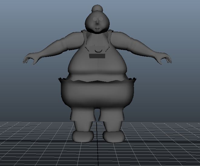
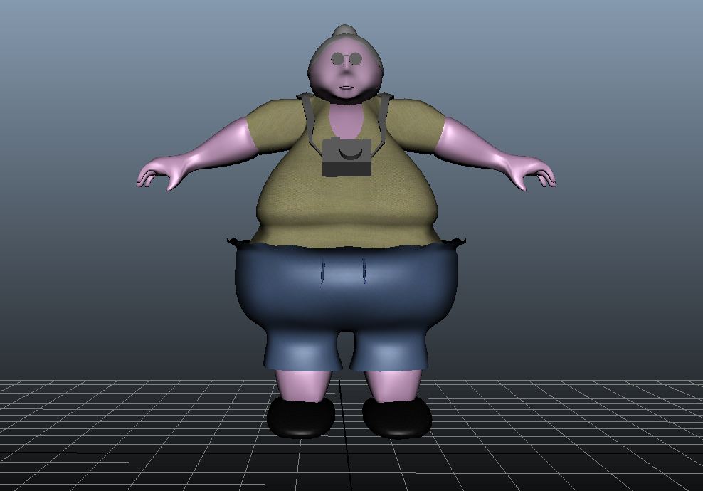
 If I were to change something about my animation, than I would probably design some aspects of my character differently. The way I created the legs and waist made it quite difficult and awkward for my character to bend her legs. This is because the hips extend out further than the legs do, so the knee would often end up going up into the waist whenever I tried to have her bend a leg. Also this made it quite difficult to paint weights onto the character as well, and it meant I had to spend a lot of time trying to figure out how I needed to skin her in order to have the most natural looking leg bend that I could get.
… then a dress would be far more revealing than what I would want. This led to the decision to give the character shorts and T-shirt.
Originally for the ocean, I was just going to have a solid blue color instead of the moving material that I ended up using. This was because I had no idea of the ocean material existed. This is what it looked like…
I hated this design and I thought it looked terrible. It was because of this that I desperately searched for
a good substitute, and ended up discovering the ocean shader. I was far happier with this material, as
it not only added more life to the scene but it also came with options that allowed me to customize the
ocean to how I wanted it.
Another decision that proved to be critical was my choice of skin colour. The idea I had from the start of the creative process was that I wanted to design a colourful and bright character, as it I felt it looked good in the 2D character designs I made. However when applied it to my 3D model it looked terrible and creepy. It was far too pink and plastic looking as it was also a blinn material. My peers also found it pretty ugly, so it was the right choice to change it. The next skin texture I found was far better than this solid pink colour. This experience helped me to realise that I the future when I am designing a 3D character I need to consider how the design will look in 3D, because just because a design looks good in 2D does not necessarily mean it will work well in 3D. 
No comments:
Post a Comment